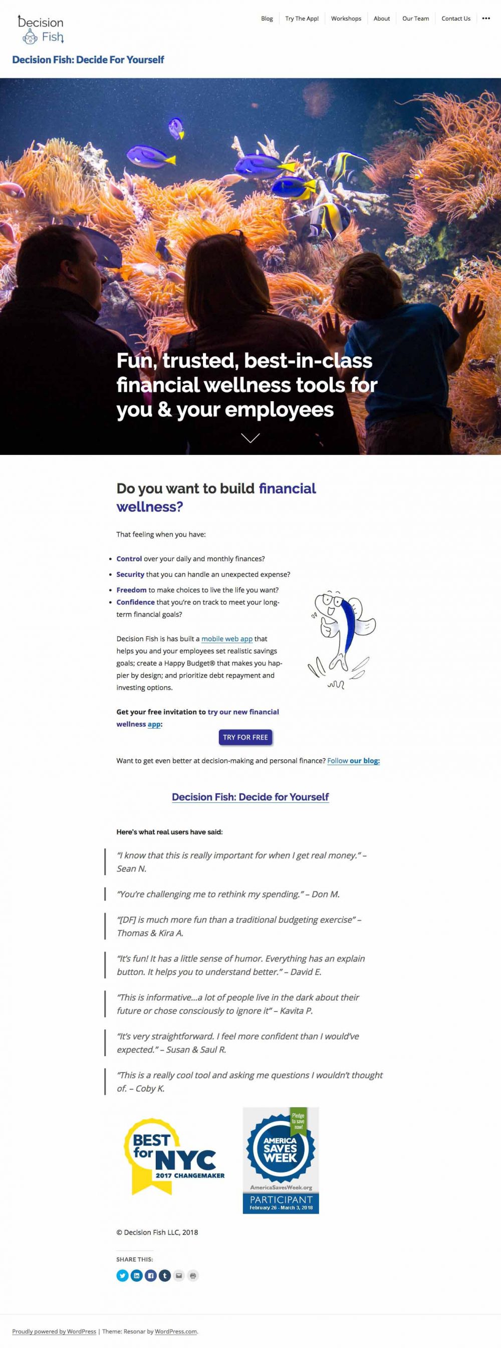
First impressions
Without reading anything but the URL name and taking in the visuals of the page on page-load, I thought I might get some help deciding on what kinds of fish might be best in my home aquarium. Then I started reading, and quickly understood that DecisionFish is a financial planning tool – but one that I as a business owner might use. It isn’t inherently clear if this is for individuals too, but the user testimonials seem to point that way.
I incorrectly assumed that the purple text indicated links. After clicking a few, I realized that was not the case. I’m searching for a little more context about the value of the app- specifically how it does what the few bullet points claim. Ultimately, all these CTA’s win over and I decide to try the app since I can’t find the context I need on the homepage.
Clicking “Try the App”, I expect to get some kind of interface that mirrors the app experience. I expect to input some of my spending habits or other financial info, and I’d get some kind of high level recommendation as a teaser to get the full recommendation through the actual app that I would be prompted to download/sign up for/ etc.
However, it seems like I get a prompt to read a blog (another link without a ton of context, when what I’m doing is actually trying to find the context to understand things…) and instead of actually experienceing any part of the app, I’m prompted to sign up for the newsletter? Kind of a bait and switch here. If I got to the point where I understood the value of the app, understood that it’s still in development, but I feel intrigued enough to try it, I don’t mind signing up. But those steps haven’t happened yet, between the homepage and the Try the App screen. I don’t know why you want to know more about me, when I don’t know enough about you to trust what you’d be using my info for.
I continue to explore, and click on Workshops. I get a stat that may or may not actually reflect my personal situation, it just kind of assumes I’m in that 85% of people anxious about my finances. and then… it just repeats the same bulletpoints that were on the homepage. I came searching for more content, and only have things regurgitated to me. At this point, I’d probably leave and not think twice about DecisionFish. But I know you guys need good feedback so I’m pressing on!
The rest of the workshop page actually does a decent job giving an overview of what to expect. I wish this kind of content existed on the homepage for the DecisionFish App!
Jumping over to the About page, I’m still hoping to get a little more context about the App, and answer my question of “Is this for individuals? or Business Owners? or Both?” I skim to see if I can find those answers quickly. Seems like this is just more information about the company and less about the app. Employers are mentioned again, but I don’t get a sense if this is exclusively for them or not, even after reading the content here. The mission and vision is compelling, but lacks the special sauce that might help me understand DecisionFish’s unique offering. And I’m not sure how the “Decide for Yourself” tag line plays into the “let us help you decide” approach (at least as I’ve come to understand it based on the content here)
Things to note:
The “try our app” banner/notification across the top actually covers the top half of the top navigation. This was kind of annoying. I get it, that’s the main CTA, but on page-load, I have no amount of context to feel confident that I actually want to try anything. On page-load, so much room gets taken up by the aquarium photo, where I really would prefer to get into the content. (moving things up would also eliminate the “scroll to see more” chevron that’s currently needed.)
The CTA for Try the app on the home page, right in the center, takes you to the newsletter sign up. Because of this I skipped “Try the App” in the navigation. However, on second pass through the site, I realized, it takes me to a completely different page. This page gives me way more context!! I wish I went here first!!
I’m blown away. So much of my frustration and desire for context was simply due to a link to a page that was never intended to answer my questions – the app page was supposed to do that! Oh man, please fix that!
Really showcase the product you’re building. Honestly, a great inspiration for how to do this should be ProductHunt, and the products that are being launched or promoted there. The language used, the visuals, the tone and architecture of the products that are getting huge numbers of upvotes should be benchmarks, especially for a financial services tool.
Best of luck to you! I’ve spent the last 3+ years focused on very similar offerings in financial services, and I’m happy to help any way I can. Send me a note if you’d like to connect.